Welcome to Our Dining Room
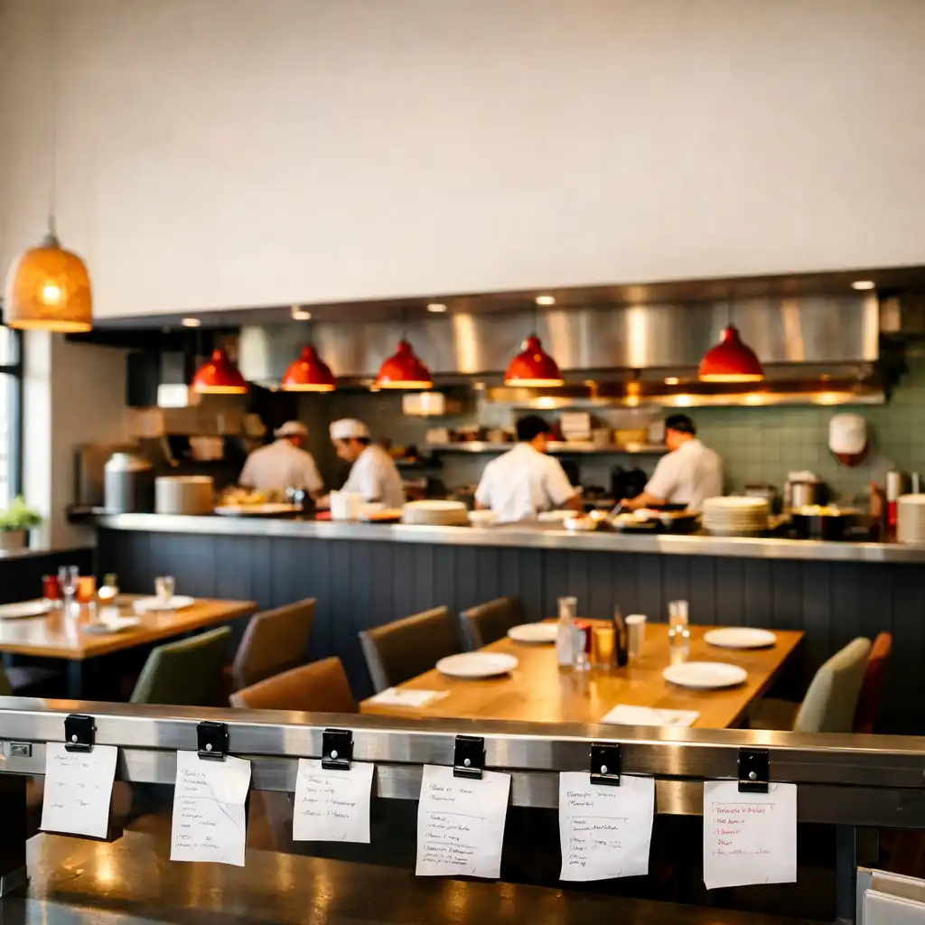
Step inside WAFFLE ADVERTISING LTD, where the energy of a working kitchen meets the comfort of a modern Australian dining room. Our interior is designed to make you feel like you're part of the action, with stainless steel rails, warm timber, and the signature tomato red and mint green accents.
The space is inspired by the Kitchen Ticket System, with visual cues like ticket rails and clipped orders throughout. Warm white walls and charcoal details create a clean, contemporary backdrop, while the open kitchen is the heart of the room, allowing guests to watch chefs at work.
Chef's note: Every rail tells the story of the night's service.
A Space That Works Like a Kitchen
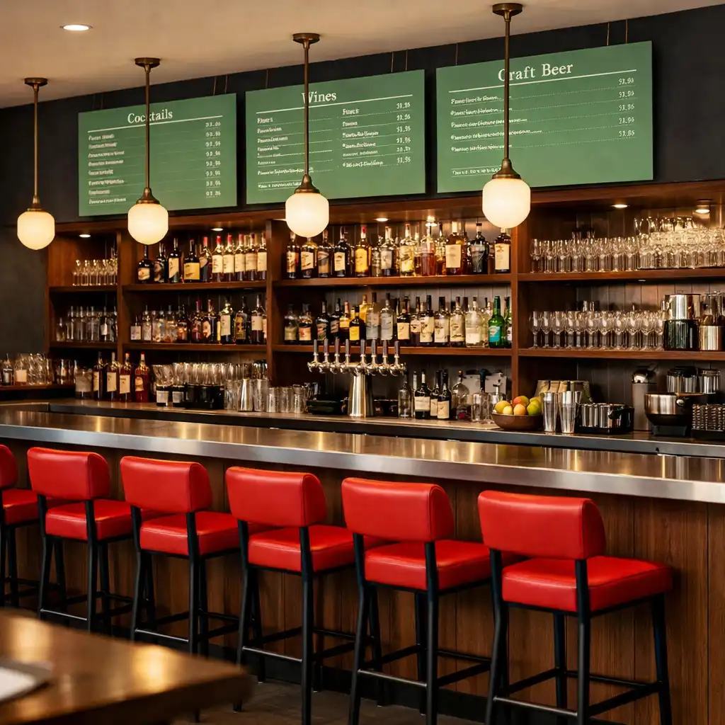
Our interior is built around the idea of a live kitchen pass. Stainless steel rails run along the walls, holding menu tickets and chef notes, while the colour palette of tomato red, mint green, and warm white echoes the freshness of our dishes. The result is a space that feels both efficient and welcoming.
The design uses the Kitchen Ticket System as a visual metaphor for the restaurant's operation. Materials include stainless steel, timber, and textured warm white surfaces. Colour accents are used sparingly to highlight key areas like the pass and bar.
Chef's note: The rail is not decoration—it is the pulse of the pass.
The Dining Room
Comfortable and Connected
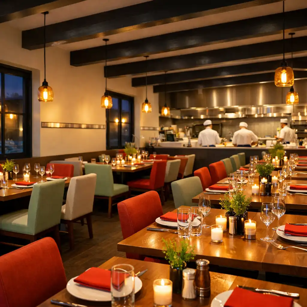
The dining room is designed for both intimate dinners and lively group gatherings. Tables are spaced to allow conversation, while the open layout keeps you connected to the energy of the kitchen. Warm timber tables and comfortable seating invite you to linger.
Seating for approximately 80 guests is arranged as a mix of booth and freestanding tables. Acoustic panels ensure a comfortable noise level, so the clatter of the kitchen never overwhelms your conversation.
Lighting That Sets the Mood
Lighting plays a key role in the atmosphere. During the day, natural light floods through large windows, highlighting the fresh colours. In the evening, warm pendant lights create a cosy glow, and the space transitions to a more intimate setting perfect for dinner and casino nights.
Large windows with sheer curtains soften the daylight, while pendant lights over tables have dimmable controls. Evening lighting shifts to warmer tones with red accents, drawing the room closer together.
A View of the Action
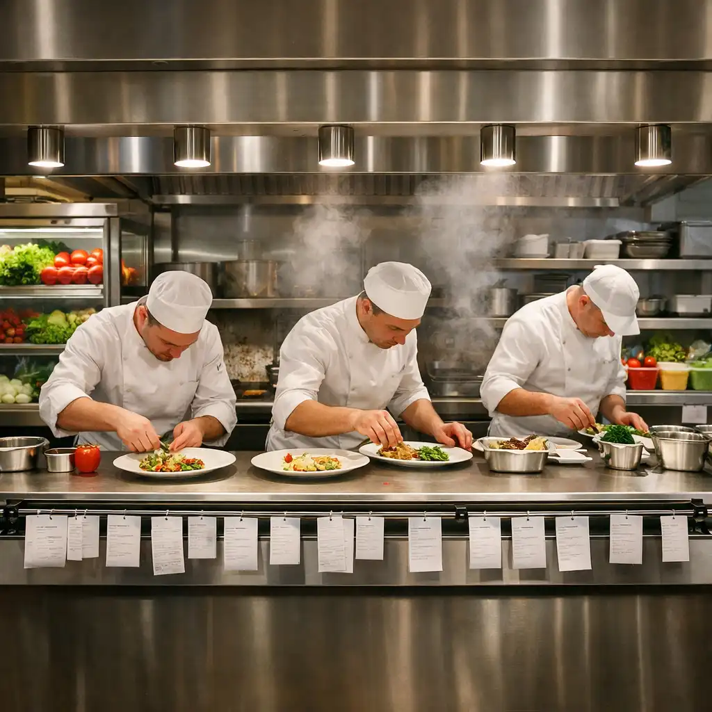
Many tables offer a direct view of the open kitchen, where you can watch chefs plate dishes with precision. The kitchen pass is framed by a stainless steel rail, and the clatter of pans adds to the lively atmosphere without overwhelming conversation.
The open kitchen is visible from around 70% of tables, and chef's counter seating is available for a front-row experience. Kitchen noise is managed with strategic design, keeping the room energetic but comfortable.
Chef's note: The best seat in the house is at the pass.
The Open Kitchen
Where the Magic Happens
Our open kitchen is the heart of WAFFLE ADVERTISING LTD. A long stainless steel pass separates the chefs from the dining room, and the clatter of pans and sizzle of fresh ingredients create an exciting backdrop. The pass is lined with ticket rails, echoing our design theme.
Chefs work in full view, adding to the theatre of dining. The pass is designed for efficiency and interaction, and fresh ingredients are displayed in refrigerated cases for guests to see.
"The open kitchen keeps us honest. We can see our guests enjoying the food, and that energy drives us to keep every plate perfect." — Head Chef
This quote is illustrative of the team's spirit and is not attributed to a named individual.
Casino Night Ambiance
A Subtle Shift
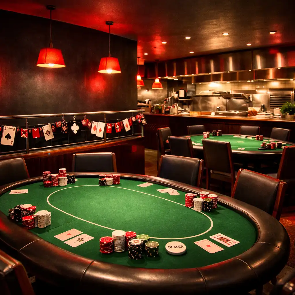
On casino nights, the interior undergoes a subtle transformation. The warm white walls are washed with a deep charcoal light, and tomato red accents become more prominent. The stainless steel rails are adorned with playing cards and chips, but the food-first identity remains clear.
There are no black and gold clichés or Las Vegas neon. The transformation is physical and atmospheric only, and dining remains the primary focus.
Poker Tables in the Dining Room
Selected tables are replaced with professional poker tables for the evening, each with a green felt surface that echoes the mint green in our palette. The tables are positioned to maintain sightlines to the kitchen, reminding guests that great food is always nearby.
Poker tables are physical and used for friendly games. There is no real-money gambling or betting, and the tables are removed after casino nights.
Roulette and Blackjack Corners
A dedicated corner hosts roulette and blackjack tables, with the roulette wheel's red and black numbers echoing our tomato red and charcoal. The area is softly lit to create an intimate feel, and the clack of the ball adds to the evening's excitement.
Roulette and blackjack are for entertainment only, with no chips of monetary value. The corner is designed to not disrupt dining.
Chef's note: The games are a garnish—the food is still the main course.
Materials and Details
Stainless Steel and Timber
The combination of stainless steel and warm timber is central to our design. Steel rails and surfaces reflect the kitchen's efficiency, while timber tables and flooring add warmth and comfort. The contrast creates a balanced, modern aesthetic.
Stainless steel is used for rails, the pass, and the bar top, while timber is used for tables, chairs, and flooring. The mix echoes the restaurant's blend of precision and hospitality.
Ticket Rail Details
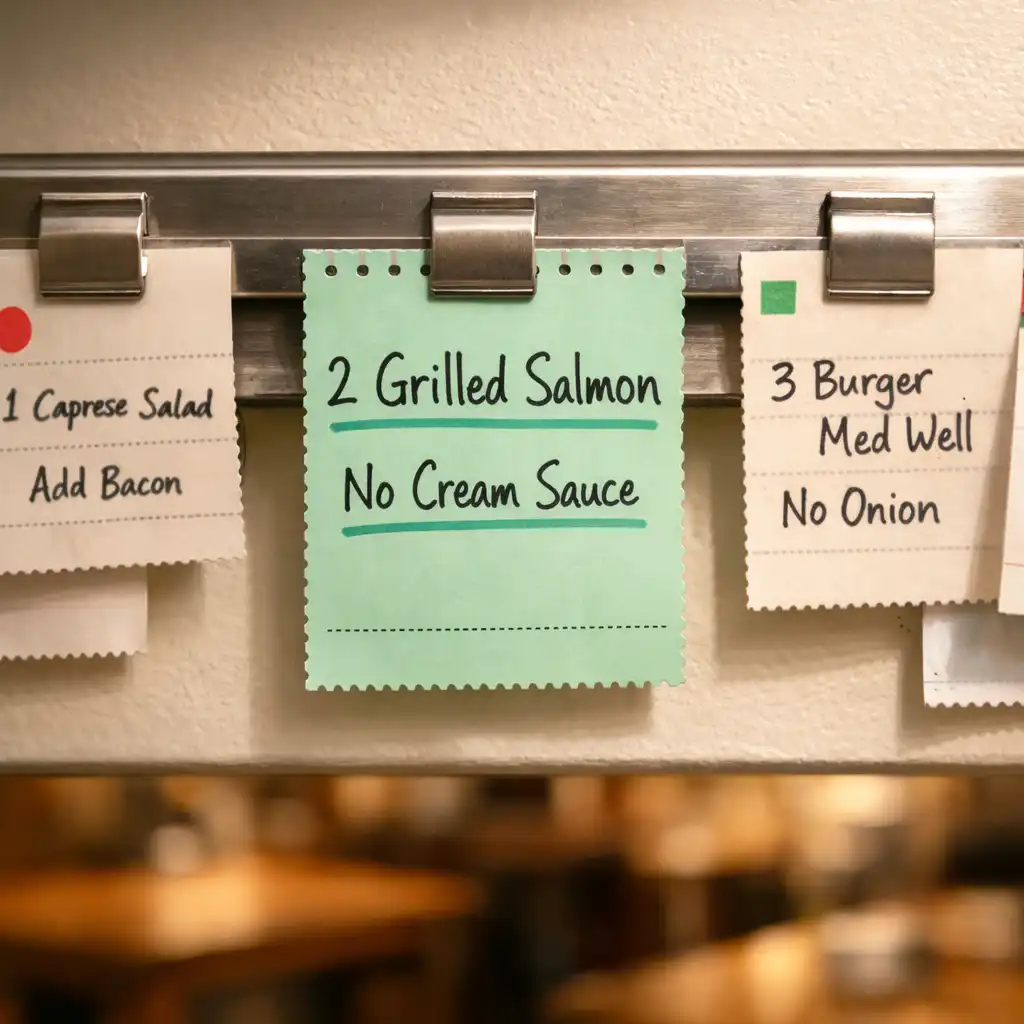
Throughout the interior, you'll notice ticket rails with clipped notes, order numbers, and chef comments. These are not just decorative; they are functional elements that reinforce the Kitchen Ticket System. Each rail is positioned at eye level to draw attention to the design story.
Rails are made of steel and run along key walls. Tickets are changed regularly to reflect the day's specials, and the perforated edges of tickets are echoed in the design.
Colour Accents
Tomato red and mint green are used strategically to highlight key areas. Red draws the eye to the kitchen pass and reservation desk, while mint green appears on menu boards and chef notes. The warm white background keeps the space feeling bright and clean.
Red is used for high-energy zones, and mint green is used for informational elements. The palette is consistent with the brand identity.
Chef's note: Colour is a tool, not a theme.
See It for Yourself
The best way to appreciate our interior is to visit us. Book a table for dinner, or join us on a casino night to see the space transform. Our team is ready to welcome you.
Reservations can be made online or by phone at +61 8 0327 6618. Casino nights are held regularly; check our events page. Walk-ins are welcome based on availability.
Book a Table